- Course
Bootstrap 3
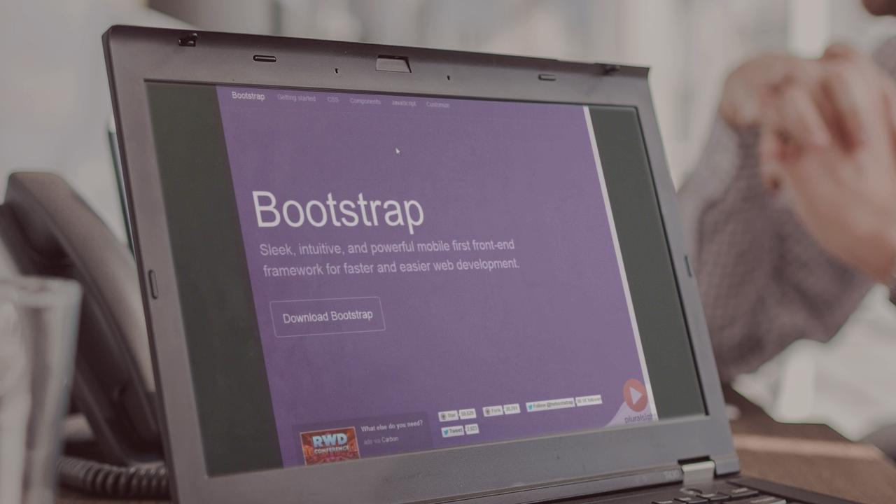
Building great looking websites that work well with different sized devices can be a challenge. Twitter's Bootstrap 3 can help you achieve a great looking and performing web site.

- Course
Bootstrap 3
Building great looking websites that work well with different sized devices can be a challenge. Twitter's Bootstrap 3 can help you achieve a great looking and performing web site.
Get started today
Access this course and other top-rated tech content with one of our business plans.
Try this course for free
Access this course and other top-rated tech content with one of our individual plans.
This course is included in the libraries shown below:
- Core Tech
What you'll learn
Building great looking websites that work well with different sized devices can be a challenge. By utilizing Twitter's Bootstrap 3 framework, you can meet that challenge head-on. Bootstrap 3 is a mobile-first responsive design framework for structuring your website's HTML. It includes a great grid system, responsive design, CSS typography and components to solve many of the most common design challenges that face web developers today.

