Text Data Visualization and Insights in Python
Text visualization uses space to visualize relationships and show data insights. This guide will explore Python text visualization libraries.
Oct 7, 2020 • 4 Minute Read
Introduction
Text data insight is derived via text analysis and mining techniques mainly practiced in natural language processing (NLP).
Cleaned and processed text data is rich and contains lots of insights. But for data scientists, text data is a bit more challenging to use to represent insights in charts and graphs because it's not numerical. Text visualization requires different skills, mainly, efficiently using screen real estate to visualize relationships between phenomena and highlight the main message. This may involve leaving some data out to allow the main insight or objective to be achieved.
Several libraries have been developed to overcome this challenge. This guide will explore some text visualization libraries primarily written in Python.
The guide assumes you have an intermediate level skill in Python and general data visualization.
ScatterText
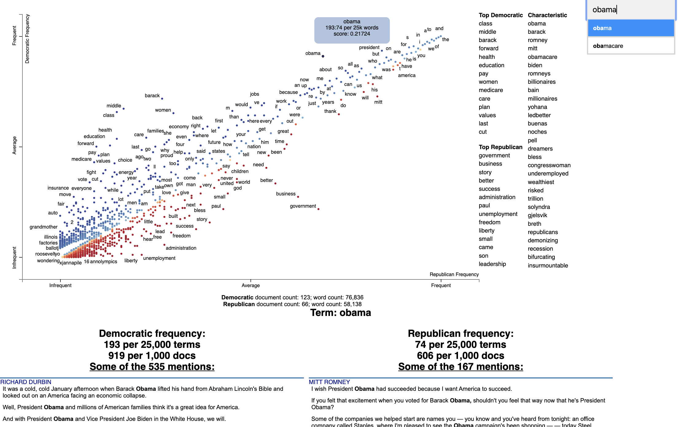
ScatterText is a powerful Python-based tool for extracting terms in a body of text and visualizing them in an interactive HTML display. The official Github repo can be found here.
To get started, install the library using pip.
pip install scattertext
To develop some code, check out a sample tutorial from the official repo here.
Sample Visualization
Source: Official Repository
Word Cloud
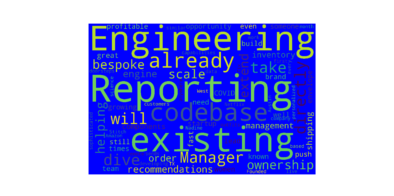
A word cloud is a text visualization technique that focuses on the frequency of words and correlates the size and opacity of a word to its frequency within a body of text. The output is usually an image that depicts different words in different sizes and opacities relative to the word frequency.
An application of this form of visualization is document summarization, where you can process a body of text within a document and, based on the most prominent words, get a general summary of what the document is all about. This can also be applied in job applications where if the job description is analyzed, the largest words to appear are most likely the most important skills for the job.
The example below explores how to develop a word cloud in Python.
Sample Code
To get started, install wordcloud to generate the cloud of text and matplotlib to plot and visualize it. To install, run the command
pip install wordcloud matplotlib
The body of text used is a job description from this link.
      import matplotlib.pyplot as plt
from wordcloud import WordCloud, STOPWORDS
# stopwords is a collection of words that dont convey meaning. mostly pronouns such as he she etc.

#generate word cloud
text = "copy_text_from_job_description_in_link_provided_above" # the input of the wordcloud generator
#generate the wordcloud object, set the height and width, set the random_state parameter to ensure
reproducibility of results and set the stopwords parameter so that the irrelevant words such as pronouns are discarded.
wordcloud = WordCloud(width = 3000, height = 2000, random_state=1, background_color='blue', collocations=False, stopwords = STOPWORDS).generate(text)
# text is the input to the generate() method
#draw the figure
#Set figure size
plt.figure(figsize=(40, 30))
# Display image
plt.imshow(wordcloud)
# No axis
plt.axis("off")
plt.show()
Results
To run the above script, copy the codeblock in a Python file and name it wc_generator.py. To run the app, run
python wc_generator.py
Conclusion
These alternative visualization skills are vital in roles that involve business intelligence, data visualization, and data science. Visualization allows you to communicate data insights graphically to an audience that may not necessarily be tech savvy.
To further build on this guide, challenge yourself to learn integrated suites such as Dash and Tableau for business intelligence and data visualization.
Advance your tech skills today
Access courses on AI, cloud, data, security, and more—all led by industry experts.


