

Tableau Essentials: Build Symbol Maps
A symbol map is a chart type in which quantitative values can be represented for various locations on a map utilizing built-in or custom symbols.
Oct 21, 2020 • 8 Minute Read
Introduction
Tableau has extensive mapping capabilities with multiple configurations to represent data geographically. A symbol map is a chart type in which quantitative values can be represented for various locations on a map utilizing built-in or custom symbols. To make the visual intuitive for the user, the size, color, and shape properties of the symbols can be leveraged. In this guide, you will learn how to create symbol maps in Tableau along with some relevant use cases.
Assigning Geographic Roles

The abc symbol beside the dimension is changed to a globe once the geographic role is assigned, as shown below. The corresponding latitude and longitude coordinates are generated automatically by Tableau's built-in map server once the geographic role is assigned to the selected field.

Note: This is an essential prerequisite step. Without the correct geographic role and generated geo-coordinates, Tableau cannot plot the field on a map.
Creating a Symbol Map
There are a couple of ways to create symbol maps.
Using the Marks Card

Next, in order to leverage the size attribute for the visualization, drag and drop the sales pill onto the size marks card and increase the size as shown below.

The color attribute for the symbols can be leveraged using the color marks card. Drag and drop the profit pill onto the color marks card.

Three insights are reflected in this symbol map:
- Geographic locations of the various states
- Sales in comparison to other states, which are represented by the size of the circular symbol
- Profit in comparison to other states, which is represented by the color of the circular symbol
It can be observed that Texas has a substantial number of sales, but they've resulted in an overall loss for the state.
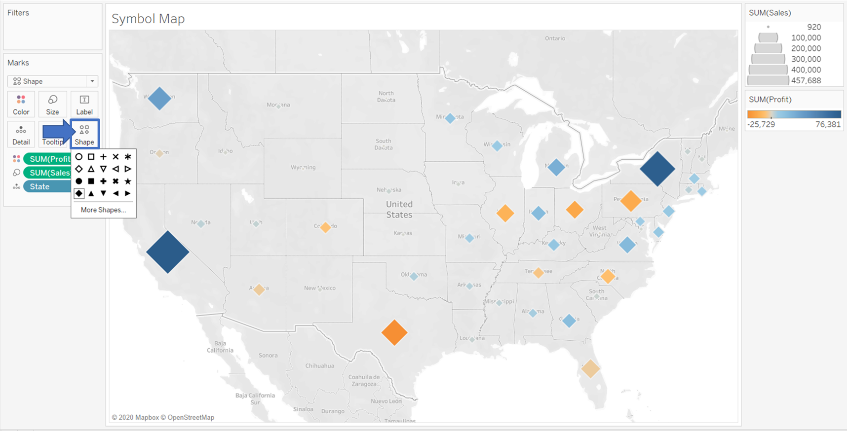
Changing the Symbol Shape
You can also change the shape of the symbol to either a built-in shape or your own custom shape.
In order to use a different shape, click on the drop-down menu in marks and choose shape as shown below.

Next, click on the shape marks card to select a shape from the default ones as desired. The selected shape gets reflected immediately on the map as shown below.
In order to add your own custom symbols, copy the image files into a new or existing folder in the shapes directory of your local Tableau repository, which can be found at the following path in Windows OS: C:\Users\<Your Username>\Documents\My Tableau Repository\Shapes. Next, click on the shape marks card followed by more shapes and then on reload shapes as shown below.

Since the custom shape was added in a folder named "My Custom Shape", it gets reflected in the dropdown menu and you can choose shapes from within that folder for your symbol map.

Upon clicking OK, the default circular symbol gets replaced by the chosen custom shape in the symbol map.

Using the Show Me Menu
Another technique for creating a symbol map is to click on a dimension with an assigned geographic role, hold the control key, click on a measure, and release the control key. Next, click on the symbol map icon in the Show Me menu, as shown below.

This results in the symbol map shown below with the chosen measure reflected per the symbol size in the map.

Using Multiple Symbols Based on a Dimension
In a symbol map, the shape marks card can also be used to allocate different shapes based on a chosen dimension or measure.
In order to reflect the state shape by region, select the shape option from the drop-down menu in the marks card. Next, drag and drop the region dimension onto the shapes marks card.

This symbol map intuitively reflects which state had the most sales in either of the regions.
Troubleshooting Tips
- If a blank map comes up with an unknown location indicator, select the appropriate country name or match the state names manually using the Edit Locations dialogue box, as shown below.

If the country name is present in the dataset, that dimension can be selected by clicking the from field radio button.

Otherwise, choose the correct country name for the states from the drop-down manually by clicking on the fixed radio button.

If any of the states are unrecognized, which could be due to spelling differences in the dataset, the state names in the data can be matched with the standardized state names in the Tableau map server backend by using the matching location column, as shown below.

Note: The same steps can be followed if you face issues using fields with another geographic role, such as ZIP code or city, but remember that even though many geographic roles are international, some are limited to the U.S. only.
Conclusion
This guide covered how to create a symbol map in Tableau with default and custom shapes, different use cases, and troubleshooting tips. Apart from symbol maps, filled maps can also be created in Tableau and are used to represent different geographic territories on a map with areas colored based on a measure or dimension.
To learn more about mapping capabilities in Tableau, check out this amazing course.
And here are a few other guides that can help you learn more about Tableau maps:

Advance your tech skills today
Access courses on AI, cloud, data, security, and more—all led by industry experts.

